Problem
MathYogi's functionality was in place, it worked but the user experience was not very good. The buttons, layout and forms were not very friendly looking and also the color palette needed some work.
MathYogi needed a rebranding and redesign of the layout.
My Contributions
Redesigned the app and coded the front end using Materialize CSS libray. Wrote media queries to make the website multiple device and browser friendly and created report cards and graphs using ChartJS data visualization library.
Quick Facts
My Role:
UI/UX Engineer
I was the UI/UX person in this team, redesign and rebranded the MathYogi app.
Team:
Vishal Bharam | Co-Founder, Frontend Developer
Siphamandla Simelane | Co-Founder, Backend Developer
Time:
Jan. 2015 - Jul. 2017
Stack:
HTML, LESS, Bootstrap, MaterializeCSS
Tools:
Adobe CC
MathYogi: Virtual Math Mentor
UI Design, Frontend development, Materialize CSS, Competitive analysis, Layout re-design, Mockups, Screenshots
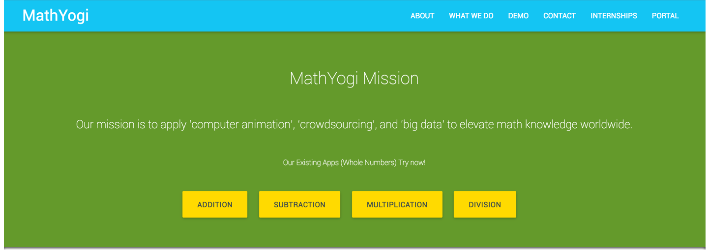
Landing Page
Screenshots of the splash page of MathYogi app.
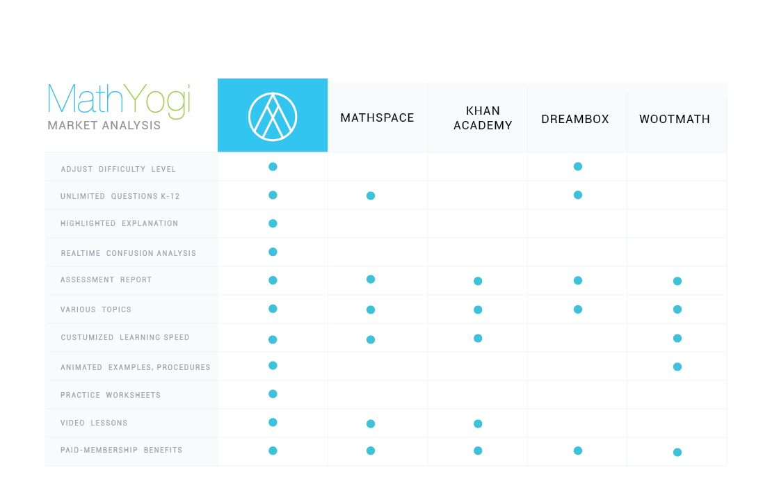
Competitive Analysis
I did a competitive analysis of existing Math Teaching Apps which included Khan Academy, Mathspace, Dreambox, Woothmath. Major focus was to analyze the features and functionality.
Version 1.0
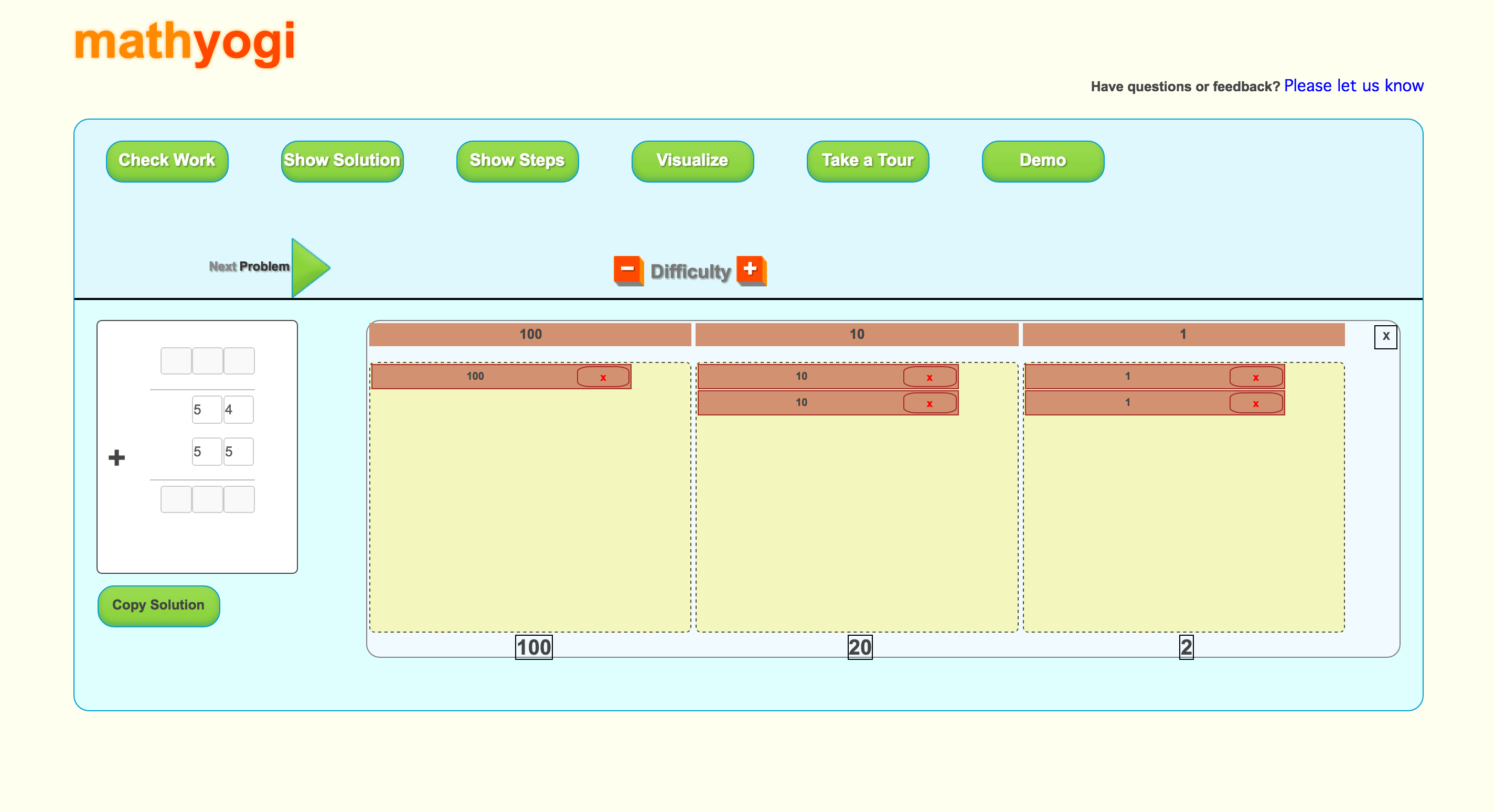
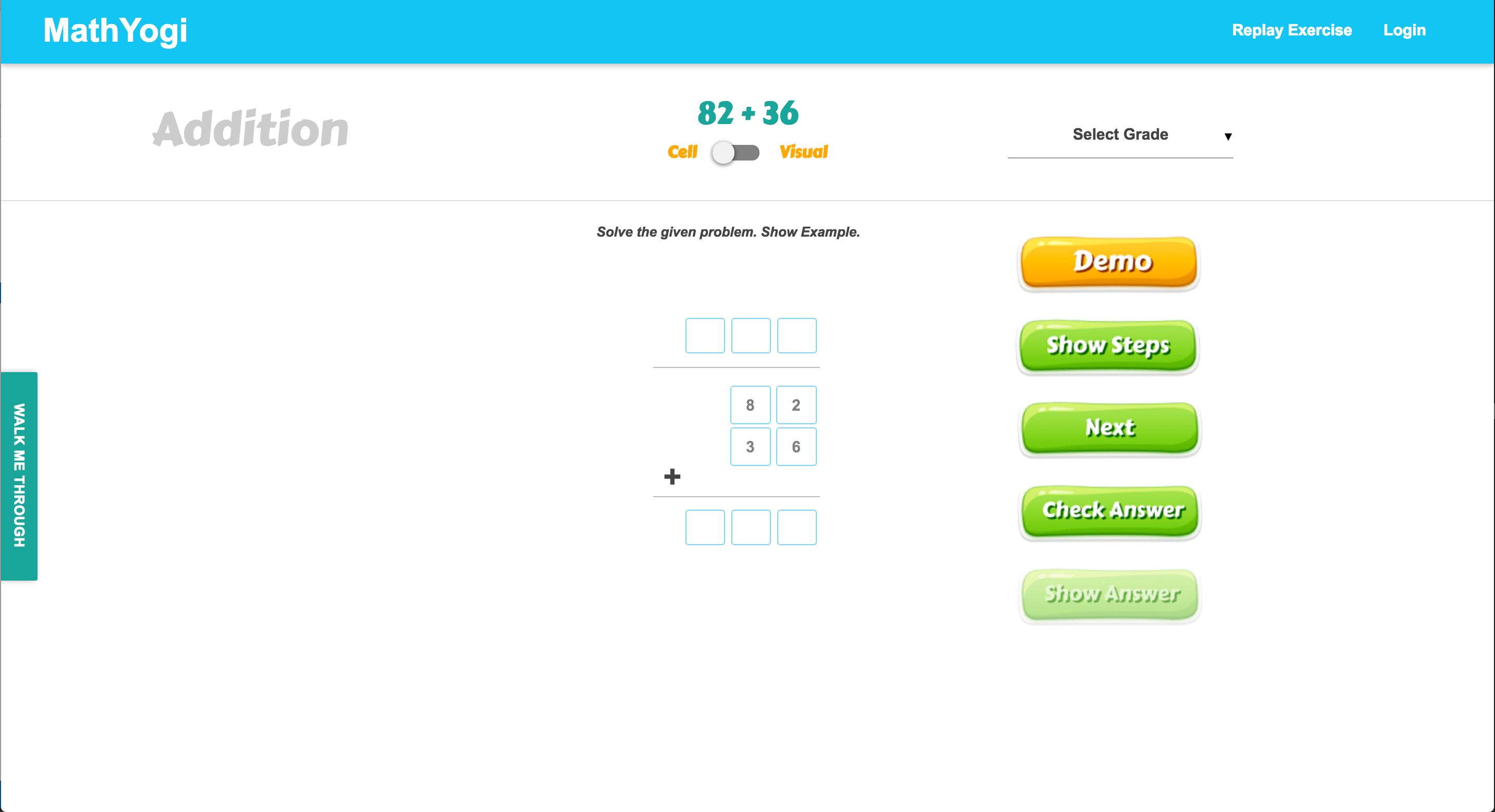
For the version 1.0 of MathYogi the major focus of the app was functionality and once the backend and logic were in place, this is what I was handed to work on.
Version 2.0
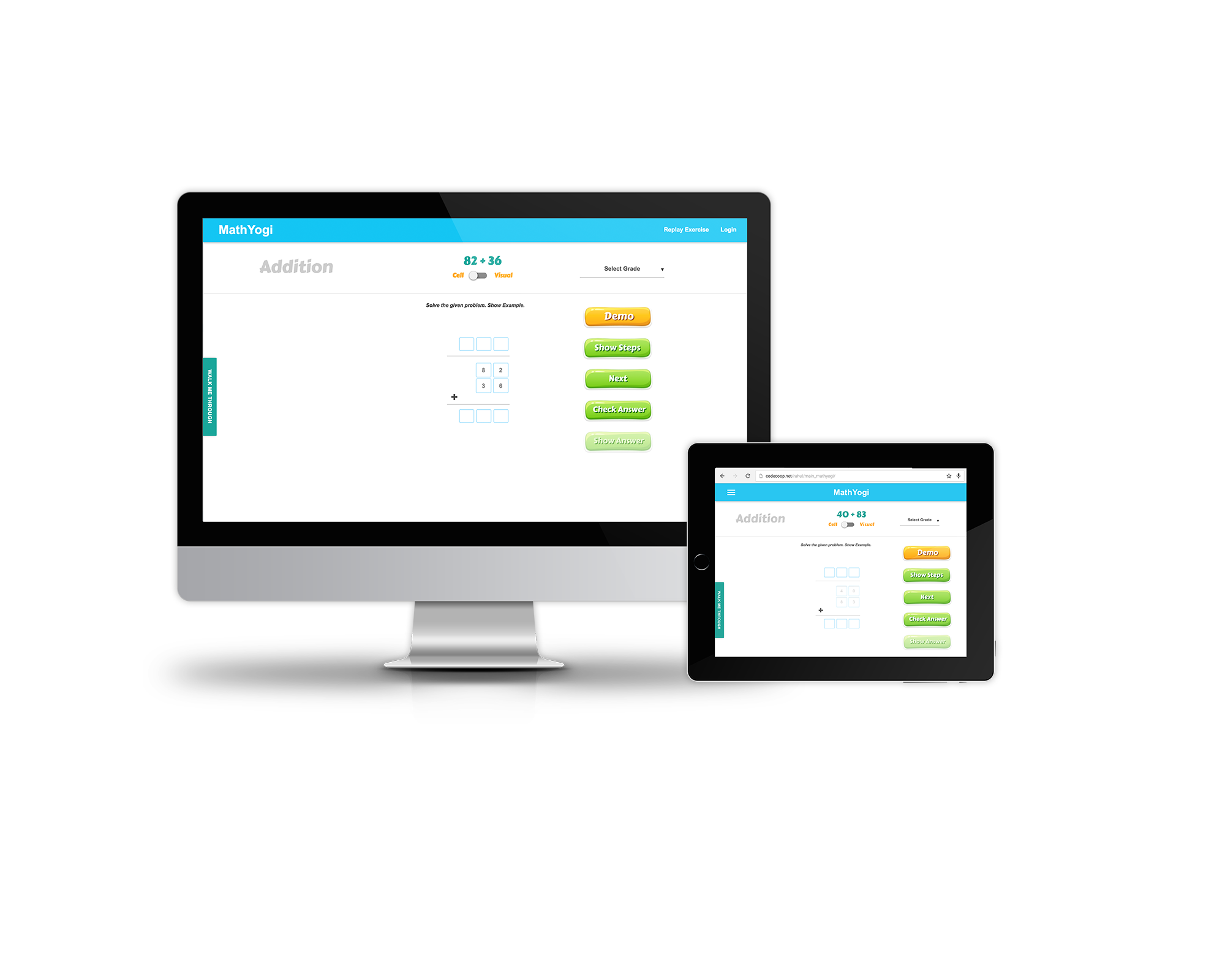
For version 2.0, I pin pointed the problem with existing User Interface. Users used to get lost and confused while using the app. The target audience of this app were kids of elementary school and teachers and when I compared the aesthetics of MathYogi to other existing apps which were doing well. I noticed the branding colors, layout, typography, and workflow all were not working well. The app UI elements seemed busy and they was adding lot of cognitive load on users. I approached this problem by keeping my users in mind and designing a warm and friendly, simple experience for them. I designed the layout, picked the brand colors, typography and removed unncessary elements which minimized the cognitive load so the user can focus more on solving math problems. I used HTML, MaterializeCSS library to code the User interface and also added the 'Walk me through' tab on left, so users can learn the features of the app if needed.
Devices mockup
I wrote media-queries to make sure the app was responsive for multiple devices including big desktops and iPads.